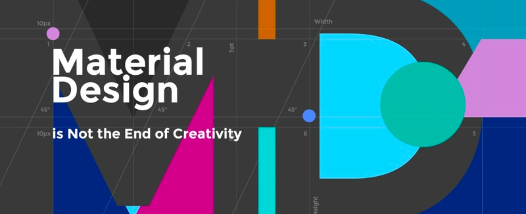
Material Design is Not the End of Creativity
There always comes a time when creativity seems to pack its stuff and go off on a long vacation to Neverland. And all of a sudden, you realize that everything you’re designing is more or less a copy of one another. That’s okay, it’s natural. But blaming it on design trends? That is absolutely not okay.
Of late, most UI designs tend to look like they belong to the same brand. I understand that it’s all about ease of operation but creativity can always blend its way in, right? Can’t we even squeeze it in somewhere? Yes, the colours and illustrations are slightly different. But do these actually make the design stand out? No.
Now, don’t blame it on Material Design, c’mon! When Google launched it back in 2014, it was supposed to be more of a guideline for designing easily comprehensible UI, and not become a set of strict codes. Unfortunately, people started using the same style over and over again for every UI they got their hands on. And this is where every application started looking like they’ve been manufactured (yes, manufactured; not designed) at the same factory. This is where all designs started looking bland, uninteresting, and brands started losing their unique identity to Google. Bye-bye creativity!
For those who are still confused about what to do with Material Design, let’s rewind back to when it started. Back then, apps were still new in the market and users were trying to figure out how to use them. The icons were new, the gestures were new, people weren’t quite sure what those symbols and images meant, whether they were supposed to swipe or tap or just shake the phone in frustration. Google understood the plight and came to the rescue with a guidebook called Material Design. They implemented the same in their designs, and gradually users began to get accustomed with the how’s and why’s of using apps. Basically, they created a standard approach to UI design, so that it becomes easy for people to understand every application.
But they never said, “Design just as we do.”
I agree that Google’s paper-and-ink metaphor is very tempting. That’s fine. Use it, but don’t stick to it. Throw in your own ideas. Here are few quick suggestions:
Colour
Pastel shades are gradually being replaced by bold, striking colours and powerful gradients. If using the paper-and-ink metaphor brings in a touch of reality into designs, then changing the colour scheme to powerful shades and gradients should connect more with reality. After all, everything in nature comes in bright hues and gradients, right? Moreover, it’s a break from the pale shades we’ve been looking at all this time. Not that pastel shades aren’t beautiful. They are. But things start getting monotonous when repeated in a loop.
Bold colours, soft stylised shadows and saturated gradients together make the interface adventurous and lively.
Typography
The favourite child of Material Design is Roboto. Sans serif fonts take up less space, and have been standardized for use in UI designs, but no one has restricted the usage to Roboto alone. Typefaces similar to Roboto are always welcome.
Roboto has been described as being geometric and allowing a natural reading rhythm. People are used to looking at Roboto, so better not surprise them with something drastically different. Find a font that agrees with these ideas, and add a difference in your design.
Animation
In UI design, the primary purpose of animation is to acknowledge input and interaction. The secondary purpose is to entertain the user. Quite often designers get tempted to introduce animation where it is least required. This ultimately results in overdoing the design and, in many cases, annoying the user.
Adhere to the rules of natural movement of objects while introducing tiny customizations of your own. These little enhancements are not only refreshing but are also essential to a brand’s unique identity.
Elements
Similar to the case of overusing animation is the case of using too many elements. The most common example of this is the floating button. Material Design has made the concept of floating button very popular, and it is, indeed, very useful in most cases. But is it the same for every case? Not always.
In many designs, the floating button is merely a distraction, and an annoying thing blocking part of the content. This is only one example. There are many other elements that are not required in a design but are included just for the sake of it because, again, “Material Design says so”. Sorry to disagree; it does not!
Iconography
Icons are one of the most important aspects in UI design in the sense that they convey the meaning of every element. They can be called the language in which the UI talks to the user. So, while it is important that the language remains the same, there can always be a customization to the script. What do you say?
This is another step towards keeping your branding different from the rest. So, it’s good to invest some time into it.
We can come up with more ideas as we move along. For now, it’s not a bad list to start with.
Cheer up, lazy people, Material Theming is here.
After spending enough time trying to educate people about the essence of Material Design, Google has given up all hopes, and have chalked out a new technique to keep designs from looking alike. They choose to call it ‘Material Theming’. According to them, this is the “roadmap for future redesigns”.
So, what is this Material Theming all about?
It is an easy way to customize your Material Design to better reflect your brand. There are three primary actions:
- customizing your theme
- applying it across all design mocks
- using it in code
Basically, Material Theming is the easiest way to deviate from creating ‘Google-cloned’ designs. You can customize colours, typography, iconography and shapes of one element, and have it reflected across the entire design. An elaborate explanation can be found on their main website.
Wrapping it up
Think of Material Design as a trend. It’s here to inspire and then pass. But your brand is here to stay. Implementation of Material Design should stop at inspiration, or else the brand loses its individuality.