UI Design Challenge by Adobe and Smashing Magazine

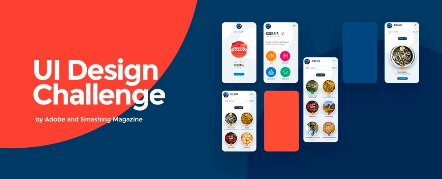
Case Study: UI Design Challenge by Adobe and Smashing Magazine

When it comes to planning a trip, we usually look for renowned places: landmarks that stand shining on the brochures or on the websites. But there are many other lesser-known places that offer similar memorable experiences, if not more. Agree?

These are known only to the locals, and unless somebody is ready to spend quite some time at one location, it would hardly be possible to explore these.

What if there was an app that listed the inconspicuous places that demand being visited? Hmm. Sounds good. Is there one?

Hold tight! We are headed somewhere.

#iconAdobeXD Challenge

Earlier this year, Adobe and Smashing Magazine jointly organized a contest for UI designers across the globe where one had to design an app prototype that guided people to the hidden gems of one’s city. The only condition was that one had to use at least five icons from one of the three exclusive Adobe XD icon kits designed by legendary designers Lance Wyman, Anton & Irene and Büro Destruct.

We decided to take up this challenge. We had 15 days in hand and a lot on our list!

Sounds exciting? It was, indeed.

So, we rolled up our sleeves, put on our party shoes and hopped on board. And yes, the coffee machine – we made sure it was working perfectly.

The Approach

The first thing we questioned ourselves was, “Who are we creating the app (prototype) for?”

For tourists, right? Doesn’t sound convincing enough.

Defining a User Persona

We hail from Kolkata – the City of Joy!

Our users can belong to three primary categories:

  1. Indian but not from Kolkata
  2. Not from India
  3. From Kolkata but hasn’t yet explored the city

In this case, we considered the extreme case that a person is not from India and has vague idea about the country, least about Kolkata. So, if one such person comes to visit our city, how would we portray it before them?

Additionally, our user can be anything between 16 to 60 years of age, can be of any gender and could have a wide range of personal tastes.

Subsequently, we found our users:

  • Martin, a college student with a lookout for adventure, and
  • Alicia, who has recently retired from her job and set out to get a taste of different cultures around the globe.

Now, the primary aim of the the app (prototype) is to deliver information about the lesser-known places of our city. Okay, but how can we make this experience seamless?

We decided to go for card sorting.

Card Sorting for Optimum Solution

When it came to finding optimum solution for the app, we received many opinions from the team. We filtered these down to the few that would work best for both Martin and Alicia.

Kolkata, formerly called Calcutta, is a perfect blend of old and new. While there’s the relaxed mood of old houses, original culture and authentic Bengali food, there’s also the flamboyance, rush, fusion culture and everything that a modern metropolitan city would encourage.

What should we emphasize here?

a) Highlight the flavour of old Calcutta only

b) Focus on the new face of Kolkata

c) Mix both old and new

We decided to go with the last option because – you guessed it – that’s what the city is all about. Moreover, we assumed that it’s what both Martin and Alicia would appreciate.

Next, we had to list the places to showcase.

Thankfully, we have someone in the workplace who has the talent to replace Google Maps (sorry, Google, no offence!) So, we sat down and jotted down all the good places – from tourist spots to food junctions to literary backyards – just anything and everything.

The Wireframes

By this time we had decided on the name of the app: “Know My City”.

The ideas were ready, the planning was ready, the name was ready. We were now all set now to sketch it out.

The Design

This was going to be the perfect interface to showcase the flavour of our city. We planned to begin the experience with a splash screen that reflected our city. This was accomplished using colours, graphics and icons.

And speaking of icons, we went for the set designed by Lance Wyman.

The Prototype

With a little design tweak here and there, we finally got what we were looking for.

The Result

Let me announce this without any embarrassment:

We didn’t make it to the top ten (sigh!)

But the whole participation part was a fantastic learning episode in itself.

Post Hoc Analysis

Due to time constraint and lack of initial planning, we could not receive input from real users. We had to rely on the user persona that we had figured out and on feedback from colleagues. And that’s where we went wrong on few decisions.

The Menu

There are two issues with this:

  1. There is no clear hint that tapping on the logo on the left will open the menu, and
  2. The open menu takes up too much space.

Not that the second one affects usability but it’s bad practice to allow so much space lying around uselessly.

Usability

We could have added a map to guide the user to the selected spot. It did occur to us at a later stage but then it was too late to conceptualize, design a screen and prototype it. So, we had to skip it.

The Logo

Many people suggested that the logo could have been something simpler, especially around the font.

Our primary keywords for the logo were:

  • Fun
  • Free
  • Travel
  • Adventure
  • Happiness

That’s how we brought the blue macaw in. But we should have had better planning on the font as it affects readability when the logo is reduced to a small size, like in the menu.

Plans on Improvising

Apart from the issues discussed, there are few other minor things on the design that we can work on. There’s always a chance to get better, right? Like this below:

Multiple Cities to Choose From

Having an entire app dedicated to only one city is simply limiting the options a user can have.

So, we have decided to let the user select a city of his/her choice. For the time being, we’ll start with two cities: Kolkata and Paris, for testing purpose, and then go on adding as we build the app.

This, in turn, means that we have to represent the soul of every city using colours and icons. Now that involves a lot of study, not to mention the effort. So, I guess there’s some time before we can come up with something usable.

Conclusion

As of now, we are planning to take this prototype to a larger scale. Maybe create an actual app out of it. Of course there are many things that need to be addressed first. For now, we’re just dreaming big.

Let’s see.

It would be great if we know your views on the prototype. Every thought counts!

And who knows, if things go well, one day we’d be requesting your feedback for this on the Play Store and on the App Store.